Originally published on DEV
Claude Opus vs Kombai in 3 Real-World Frontend AI Tests 🚀
SAShrijal Acharya·June 2, 2026 (3 months ago)
23 reactions11 comments
webdev
ai
programming
productivity
Frontend automation has been getting pretty wild lately. 🫠
A few months ago, this comparison would have been much easier to frame.
On one side, you had the Claude Opus lineup, one of the strongest coding model lineups available, running through tools like Claude Code with Figma MCP support.
On the other side, you had Kombai, a frontend-focused AI coding agent that was mostly known for turning Figma files, screenshots, prompts, and existing designs into clean frontend code.
But Kombai has changed quite a bit since then.

It is not just an AI coding agent for frontend anymore. With the newer updates, especially Design Mode, Kombai is now trying to cover a much bigger part of the frontend workflow.
That changes the comparison a little.
If we only compare it on code generation, we are kind of testing just one part of what Kombai does now. It can also help create UI designs, iterate on them visually, and then move those designs into code inside the same IDE workflow.
I will go deeper into that later in the Kombai section, because there is quite a bit to talk about there.
For this post, though, I still want to focus mainly on the part that matters most in real projects:
🤔 Can it work inside an existing codebase and ship good frontend changes without breaking things?
Because at the end of the day, that's the actual pain point of frontend.
If you’re interested, we already compared the older version of Kombai and Figma MCP here: Figma MCP vs Kombai
So in this post, we’ll look at what has changed with Kombai, touch on Design Mode, and then compare it with Claude Opus on 3 real open-source projects.
Let’s find out which one actually feels more useful. 👇

TL;DR
If you just want the takeaway, here’s the quick rundown:
- Kombai is not just a Figma-to-code tool anymore. It is now more of an all-in-one design and frontend coding agent. You can generate designs, iterate on a canvas, visually edit UI, use Figma as input, work with your real codebase, and then ship great frontend code from inside your IDE.
- Design Mode is the biggest new change. It gives Kombai an infinite canvas, Style Guides, Themes, reusable Blocks, CSS-level visual editing, and a one-click flow from design to code. It is still early, but it changes how you should think about Kombai.
- For the coding tests in this post, Kombai was still clearly stronger overall. In real open-source projects, it handled frontend implementation, codebase understanding, UI quality, and integration better than Claude Opus in most cases.
- Claude Opus 4.6 with Figma MCP is still totally fine, especially if you already work mostly in the CLI with tools like Claude Code, Codex, or whatever else. You can absolutely stick with that setup and still get solid results. It works well.
The bigger point is this:
If you are already comfortable in the CLI, there is no real reason to switch just for this. A good model with Figma MCP is more than enough for a lot of use cases.
But if you use Cursor, VS Code, Windsurf, Trae, Antigravity, Kiro, or another GUI IDE, you should seriously try Kombai at least once.
It is just a very good tool for frontend work.
I’ve been using Kombai for more than 10 months, and it still feels kind of wild sometimes. Honestly, I have Cursor installed on my machine for Kombai alone. That’s how useful it has been for me.
Brief on Kombai
💁 Kombai is an all-in-one design and frontend coding agent for building production-ready frontends
Kombai used to be easy to describe as a frontend AI agent.
This is still true, but now its just a small part of what it can do.
The better way to describe it today is this:
It's an agent specially designed for frontend unlike usual coding agents like Claude Code, Codex or anything else.
That specialization shows up in a few places:
- It understands frontend stacks and component libraries
- It can parse Figma designs natively
- It can work with existing components, tokens, hooks, and design systems
- It can visually inspect and edit the browser output
- It can generate UI designs before writing code
- It focuses more on production-ready frontend changes, and not a generic app generation
The biggest recent update is the Design Mode.
With Design Mode, Kombai can generate UI designs directly inside your IDE. You can start from a prompt, image, website, or Figma reference, and Kombai creates editable UI designs that you can change visually.
Here’s a quick demo of Kombai’s Design Mode in action by Beau Carnes (core team member of freeCodeCamp).
It also has proper design-system-ish primitives now:
- Style Guides for controlling the overall visual direction
- Themes for reusable design tokens
- Blocks for reusable design elements
- Variants for trying multiple design directions
- A CSS editor for visual tweaks
- and many more...
These designs live as .canvas files in your repo, which means they can be version-controlled with git like your code.
Once you like a design, you can hit Code design, and Kombai moves it into Code Mode, reads your project, understands your stack, reuses relevant components and tokens, and codes it into working frontend.
That is what makes it feel different from tools like v0, Lovable, or Bolt.
Those tools are great for generating prototypes or apps from scratch. Kombai is more focused on your existing frontend repo. It works inside your editor and tries to build the thing using the stack you already have.
Check out this intro demo Kombai 2.0. The first AI design engineer.
Tweethttps://x.com/i/status/2061825199247614316With Kombai, you can not only create designs, but also get the safety of knowing that no backend code is ever touched, which ensures your business logic is not mistakenly changed.
You can add it right inside your editor. It works with VSCode, Cursor, Windsurf, and Trae. Just grab it from the extension marketplace, launch it, and you’re ready to go.
With Kombai, you can:
-
Generate UI designs from scratch using Design Mode.
-
Turn Figma designs into code without setting up Figma MCP separately.
-
Turn Figma designs into code (React, HTML, CSS, etc.) using the component library your project already uses.
-
Use screenshots, images, websites, or natural language as input.
-
Reuse existing components, hooks, design tokens, and frontend conventions from your repo.
-
Visually inspect and edit your UI through the Kombai Browser.
-
Work with a frontend-smart engine that understands 30+ libraries, including Next.js, MUI, and Chakra UI.
-
Most importantly, preview the changes in a sandbox so you can approve or reject the change before committing it to the files.
Head to the docs to get started and find the setup for your editor.
You can be up and running in under a minute:
- Install the extension for your editor
- Sign in and connect your project
- Pick the mode you need: Code, Plan, Design, etc.
- Paste a Figma link or describe what you want to build
- Paste a Figma link, describe what you want, attach an image, or work from your existing code
- Review the output and commit your code
If you spend most of your time on the frontend, this is a no-brainer.
Now comes with 100 award winning landing pages that you can make your own.
Tweethttps://x.com/i/status/2061825201730695550One Important Note Before the Tests
Kombai now has a much bigger features and design support than it did before.
But this post is still mainly a frontend coding and implementation comparison.
So, I am not going to deeply test Design Mode here. That deserves its own separate post because the right comparison there would probably be against tools like v0, Lovable, Bolt, and maybe Figma-based workflows.
For this post, the test is still:
- Can it understand a real codebase?
- Can it preserve functionality?
- Can it implement a feature cleanly?
- Can it match or improve UI quality?
- Importantly, can it work in a large real-world existing project?
That is exactly what we are going to test here.
Test Workflow
In this model test, I’ll be using Claude Opus 4.6 with everyone’s favorite CLI coding agent, Claude Code, along with Figma MCP support.
💁 Just in case you're interested in how to add MCP support to Claude Code, you can view the guide here.
For Kombai, the choice mostly comes down to the IDE, so I’ll go with Cursor. It does not really matter much which IDE you use, though. VS Code would work just fine too.
We’ll test both tools on three decently complex tasks in real-world open-source projects with hundreds of thousands of LOC.
- A frontend-heavy task with Figma
- A frontend + backend task with more implementation complexity
- A task that relies more on codebase understanding than implementation complexity
I’ll compare both tools on:
- time to complete the task
- quality of the code
- how closely the final output matches the given design or feature intent
💡 Note: I’ll share the source code changes for each task from both tools in a
.patchfile. That way, you can easily reproduce them on your local system by cloning the repository and applying the patch withgit apply <path_file_name>.
Note: As I’m using a Claude plan and not API usage, price is roughly estimated based on the output tokens.
Real-World Coding Comparison
The entire test in this blog is going to be on top of real-world open-source projects that are used by thousands of people, not toy projects, but ones with thousands of LOC.
All three tests are going to be on 3 different projects, all open-source, of course!
Let's start with an easier one, a shadcn template repository with Figma MCP.
Test 1: Rebuild an Open-Source Project UI (with Figma MCP)
For this test, I'll be comparing both of them on a Figma file, giving them access to a Figma MCP server.
You can find the Figma design template for this test here: Dashboard
Prompt:
Implement the provided Figma dashboard design in this existing Next.js + shadcn/ui dashboard codebase.

<figma_url>

Constraints:

1. Preserve all existing functionality exactly.
2. Do not break routing, state, existing interactions, or responsiveness.
3. Replace the current dashboard presentation layer with a UI that closely matches the Figma design.
4. The Figma is food-delivery themed. Translate only the content domain, not the visual system.
5. Keep the layout, structure, and styling language of the Figma as intact as possible.
6. Replace food-specific labels and data with content that fits a generic admin dashboard.
7. Reuse existing logic and data bindings wherever possible.
8. Avoid adding fake backend logic.
9. Keep the implementation production-quality and componentized.

Focus areas:

- sidebar
- header/top bar
- summary metric cards
- chart section
- table/list section
- filters/search/actions if present
Claude Opus 4.6 (with Figma MCP)
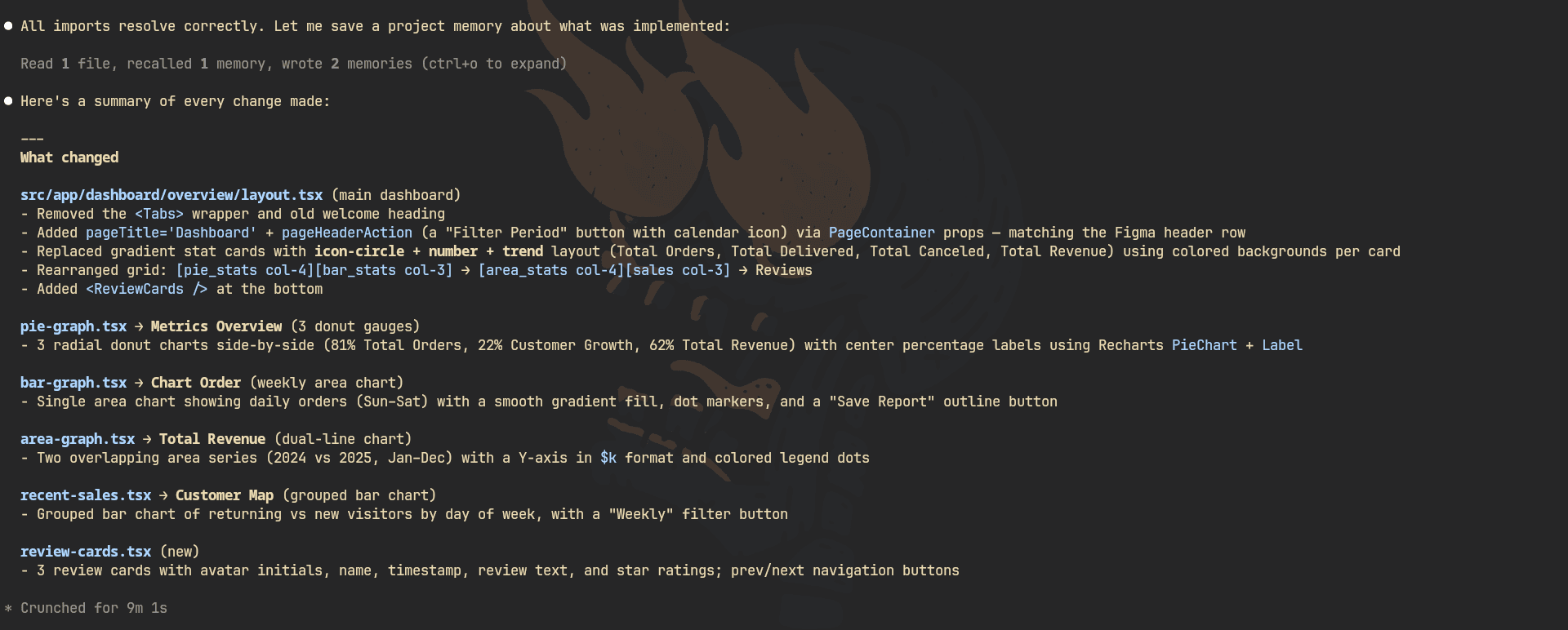
Here's the response from Claude Opus 4.6:
You can find the code it generated here: Opus 4.6 source Code
Opus did a pretty good job here.
Given the Figma itself was not even made for a generic admin dashboard in the first place, there was obviously some room where it had to improvise a bit on its own.
But the main thing I was testing for here was not just whether it could make the frontend look close enough. The actual ask in the prompt was to preserve and support the existing functionalities as well. That part just was not really there. It did not add the interactivity support properly, which was the whole point of the test after all.
So visually, sure, it looks alright. But if the interaction layer is missing, that is a pretty big miss for this kind of task. If it had nailed that part too, this would have been a really strong result. But it didn’t.
- Output token Cost: ~$0.125
- Duration: 9 minutes 1 second
- Output Token Usage: ~8K
- Code Changes: 6 files changed, 420 insertions(+), 422 deletions(-)
Kombai
Here's the response from Kombai:
You can find the code it generated here: Kombai source Code
Kombai nailed this one. Even better how accurately it finds out the tech stack.
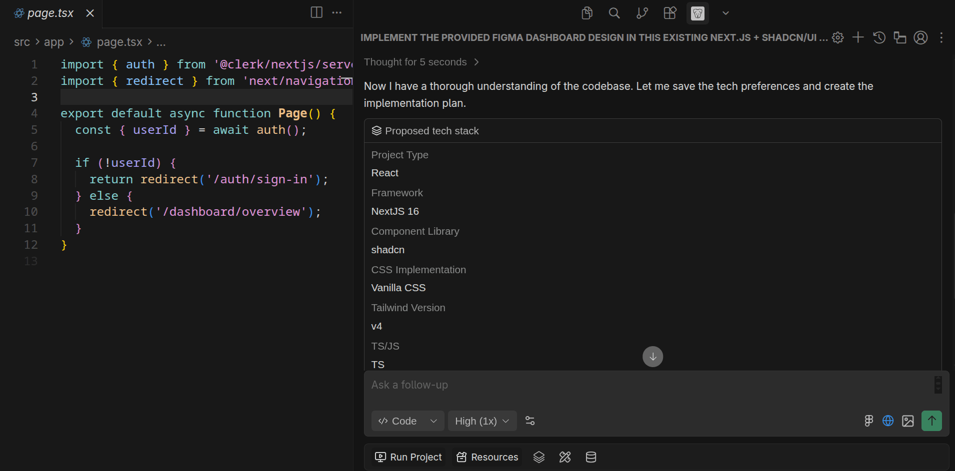
The frontend turned out really good. More importantly, the interactivity is there, which is the main thing being tested other than how close it comes to the Figma design. It actually respected the fact that this is an existing app, with behavior that still needs to work.
And if I compare both the UI itself and the overall build quality from a production POV, Kombai clearly did better here.
That said, there was one issue I noticed while working with Kombai.
After it finishes the implementation, it has this nice default feature where it opens up a browser preview and lets you chat there to fix smaller things quickly. In theory, that sounds great. In practice, for apps that require authentication, which this one did, it falls apart. Google OAuth simply flags it as unsafe, so you cannot log in there at all.
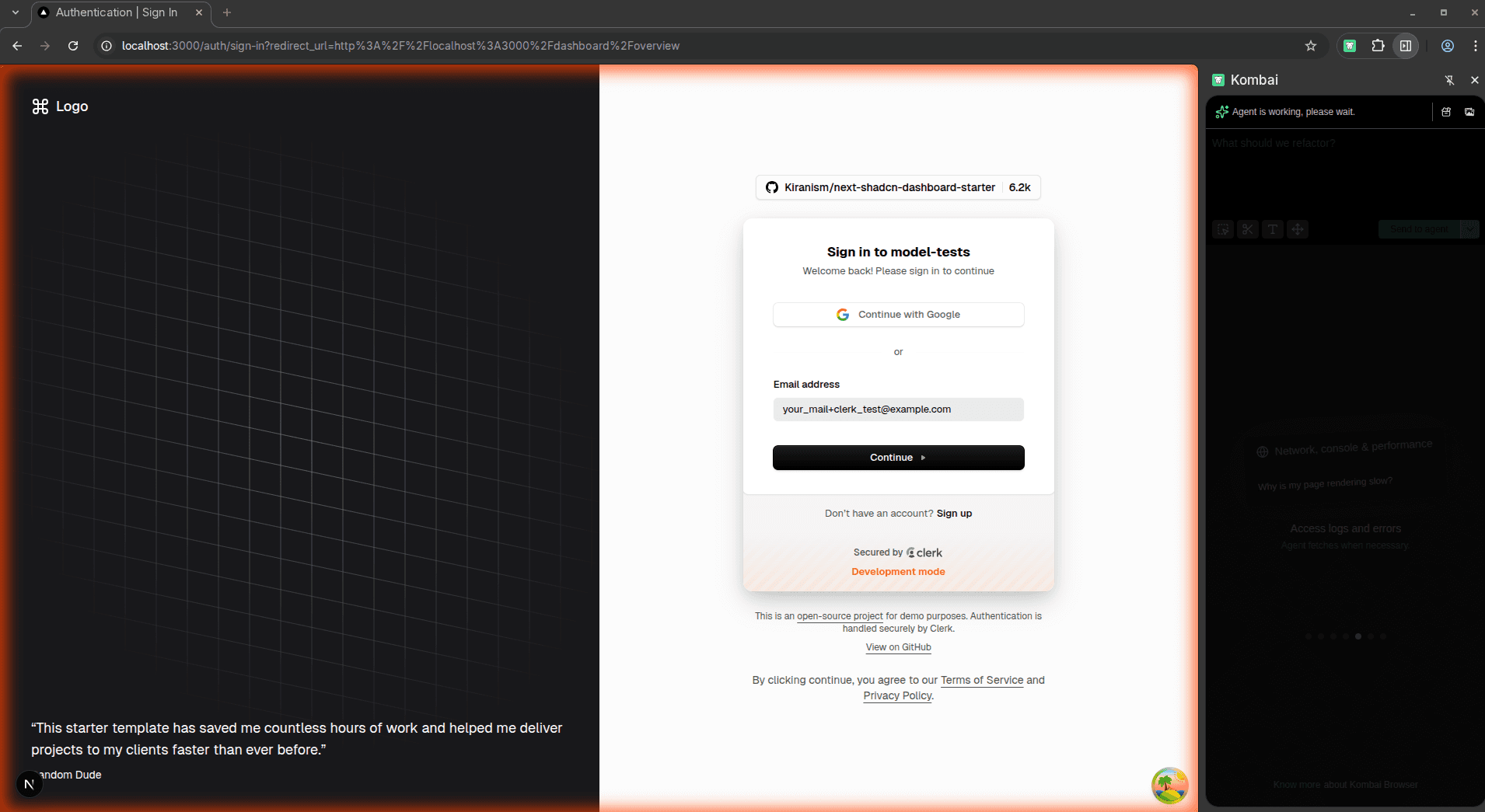
So yeah, they definitely need to work on that.
Still, overall, the user experience and the actual result were top notch.
- Duration: ~12 minutes
- Code Changes: 12 files changed, 940 insertions(+), 532 deletions(-)
I noticed the project also has standalone Kanban board support, so why not quickly test it on this as well?
Prompt:
Completely refactor the Kanban board UI in this open source project based on this Figma:

<figma_url>

This should be a real UI redesign, not minor styling tweaks. Study the Figma closely and make the board feel much more polished, modern, clean, and cohesive. Improve layout, spacing, typography, hierarchy, cards, columns, controls, interaction states, and responsiveness.

Preserve functionality, but refactor components and styling where needed so the code is cleaner and the design is more consistent. Focus heavily on UI quality and make the final result feel much closer to the Figma overall.
Claude Opus 4.6 (with Figma MCP)
Here's the response from Claude Opus 4.6:
You can find the code it generated here: Opus 4.6 source Code
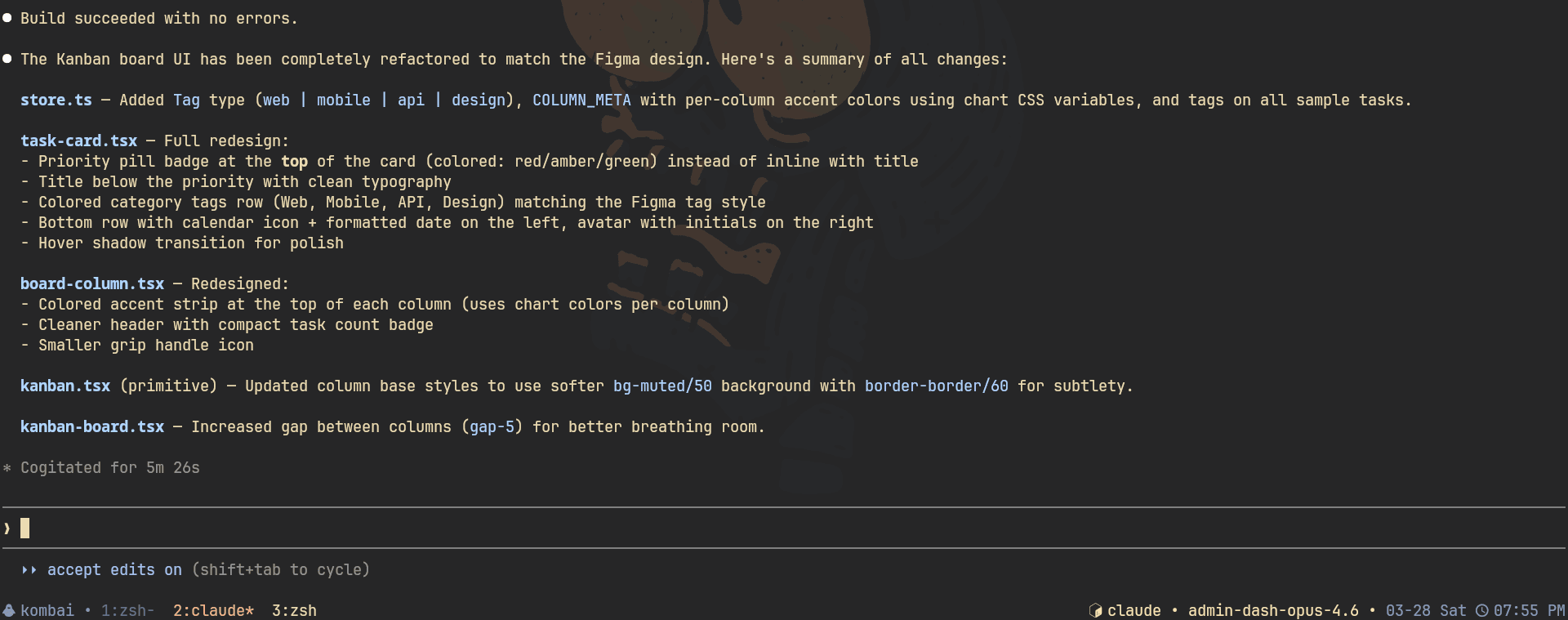
Opus did pretty well here too.
The good part is that functionality was not broken. The board still works, and that matters a lot for a refactor like this. The redesign itself is also nice. It is clearly better than before.
That said, if I look closely at the actual design match, it seems to miss a little here and there. It does not feel quite as locked in to the Figma as the best result should.
- Cost: negligible
- Duration: 5 minutes 26 seconds
- Code Changes: 5 files changed, 162 insertions(+), 56 deletions(-)
Kombai
Here's the response from Kombai:
You can find the code it generated here: Kombai source Code
Again, Kombai was excellent here.
Honestly, this one came out awesome. It matches the Figma really well, preserves the expected behavior, and feels like a proper redesign.
- Code Changes: 4 files changed, 362 insertions(+), 72 deletions(-)
- Duration: ~6 minutes
Test 2: Add a Feature in Uptime Kuma
There's this open-source project that's super popular for the self-hosted monitoring service Uptime Kuma, with over 84K stars on GitHub.
Here's an existing issue on the project that we will try to build: Calendar Graph
Prompt:
Add a heatmap-style uptime history section to the public status page in this existing Uptime Kuma codebase.

Constraints:

1. Keep all existing functionality working.
2. Do not break the public status page, responsiveness, or current monitor behavior.
3. Build this as a proper feature inside the existing architecture.
4. Reuse existing logic and data flow wherever possible.
5. Avoid fake backend logic or hardcoded mock data.
6. Make the heatmap work independently for each service.
7. Keep the UI consistent with Uptime Kuma’s existing style.
8. Make the implementation clean and production-ready.

Focus areas:

- status page
- per-service uptime history
- heatmap UI
- state management
- backend integration
Claude Opus 4.6 (with Figma MCP)
Here's the response from Claude Opus 4.6:
You can find the code it generated here: Opus 4.6 source Code
Opus actually got the overall feature in place, and to be fair, the core thing does work.
That said, there is a bug.
When you try to change the monitoring duration for one service, it also changes it for all the others. That is obviously not how this should behave, and for a feature like this, that kind of state handling bug is a big issue, of course!
Other than that, there is not a whole lot to complain about. The core functionality works, just with some caveats, and that feels fair. I do not think it is realistic to expect the model to get every detail perfectly right in one shot on a non-trivial codebase.
- Output token Cost: ~$0.12
- Duration: 13 minutes 5 seconds
- Output Token Usage: ~7.5K
- Code Changes: 4 files changed, 784 insertions(+)
Kombai
Here's the response from Kombai:
You can find the code it generated here: Kombai source Code
Kombai did this one properly.
The feature is implemented correctly, the behavior is right, and even the bug that showed up in the Claude Opus implementation is not there at all.
That part matters because this is not just about working on the UI. It's about putting the feature into an existing project.
- Duration: ~10 minutes
- Code Changes: 4 files changed, 809 insertions(+), 1 deletion(-)
Test 3: Add a Feature to Chatwoot
This is a little different from the other two tests.
This was more of a test to see how well the model actually understands the codebase and less about generating or working on the UI heavily. The code change isn't going to be huge, but it tests the two on how good they are at understanding the codebase and adding a feature on top.
Prompt:
Add a new "Participating" tab to the chat/conversation list in this existing Chatwoot codebase.

The goal is to let users quickly view conversations they are participating in, while keeping the implementation fully aligned with how Chatwoot already handles conversations, tabs, filtering, permissions, and dashboard state.

Constraints:

1. Preserve all existing functionality exactly.
2. Do not break existing conversation list behavior, routing, filters, permissions, or dashboard interactions.
3. Add "Participating" as a proper tab in the existing chat list UI, not as a separate temporary view.
4. Make sure the tab only shows conversations the current user is participating in.
5. Reuse existing backend, frontend, and store patterns wherever possible.
6. Avoid hacks, fake data, or disconnected logic.
7. Keep the implementation production-quality and consistent with the current Chatwoot UI.
8. Ensure permissions and visibility rules continue to work correctly.
9. Make the feature feel like a native part of the product.

Focus areas:

- chat list tab integration
- conversation filtering
- backend query support
- participation-based logic
- store/state updates
- correct tab placement in the UI
Claude Opus 4.6 (with Figma MCP)
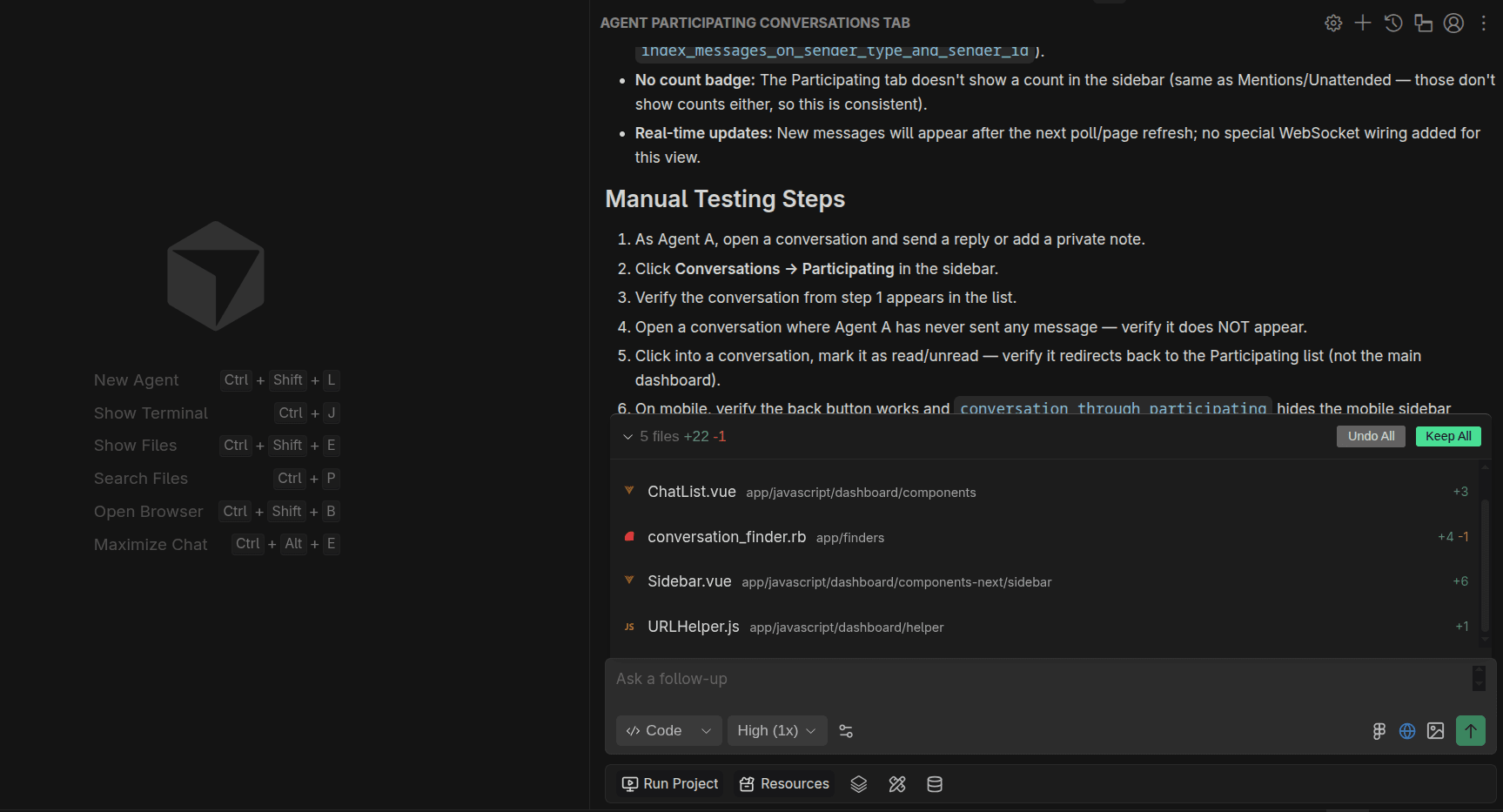
Here's the response from Claude Opus 4.6:
You can find the code it generated here: Opus 4.6 source Code
Opus nailed this one.
This is exactly the kind of test where you are not making massive frontend changes, but instead need a solid understanding of how the app actually works so the feature fits naturally into the existing codebase.
The only issue I noticed was some UI flickering. But that looked more like a minor issue than anything wrong with the feature implementation itself.
Other than that, it worked perfectly.
- Output token Cost: ~$0.02
- Duration: 12 minutes
- Output Token Usage: ~1.3K
- Code Changes: 13 files changed, 52 insertions(+), 11 deletions(-)
Kombai
Here's the response from Kombai:
You can find the code it generated here: Kombai source Code
There was no flickering here, and Kombai also placed everything where it actually made sense. Claude got the logic right too, but the tab placement felt a bit off. Kombai just tied it together better, and the whole thing felt a bit cleaner.
So overall, both did well here, but Kombai’s result felt cleaner and better integrated.
- Code Changes: 7 files changed, 30 insertions(+), 9 deletions(-)
- Duration: ~8 minutes
Final Verdict
So, what’s the takeaway?
After testing both on real tasks in real codebases, Kombai was clearly stronger for frontend work.
That is not to say Claude Code with Opus 4.6 is bad. Far from it.
It is one of the strongest coding models available right now, and it can do some serious work. In some cases, especially the Chatwoot test, it understood the codebase really well and shipped something that was genuinely solid.
Claude Opus lineup is too good for general coding.
Kombai is a frontend specialized tool.
And for frontend-heavy work, that specialization really shows.

That said, I do not think you should take my word for it blindly.
Also, this does not mean Kombai will win every project or every workflow.
If you are doing backend-heavy work, infra changes, full-stack architecture, or mostly CLI-based development, Claude Code still makes a ton of sense.
The design side is also getting more interesting now. I did not fully test Design Mode in this post, because that deserves a separate comparison.
Honestly, the best way to judge tools like this is to try them yourself. A comparison like this can give you a rough idea, but it really clicks only when you use them on your own codebase and see how they actually feel.
That’s all for this one. Thank you for reading! ✌️